Smartphone-friendly or Smartphone-specific websites
What’s the difference between a Smartphone-friendly and a Smartphone-specific website?
Good question.
Put simply, a smartphone-friendly website is a display of the entire website content you see on a desktop (PC) monitor reformatted to fit the narrower and smaller smartphone.
Images are automatically resized (reduced) and displayed one-on-top-of-the-other (vertically stacked as opposed to side-by-side). Where necessary, text areas will also be automatically moved to fit within the narrower width of a smartphone.
Websites that automatically adjust to fit the narrower width of smartphones are known as Responsive Websites. All websites developed by Taunton web company Somerset Web Services are developed with Responsive technology to ensure they are aesthetically pleasing on both desktop monitors and smartphones.
However, a smartphone-specific website is a subset of the entire website. It typically has all (or most) images removed. It will normally have fewer pages. Descriptions (text) tend to be more succinct as they are aimed at a mobile audience which typically has less time to read in-depth articles.
Images are intentionally removed to speed up the load time on a smartphone which may be across a 3G connection. Reducing the data download is very important as most smartphone users pay per GB of download. Smartphone users may not be too happy with an expensive phone bill to download your gallery of 24 images all over (say) 1MB each!
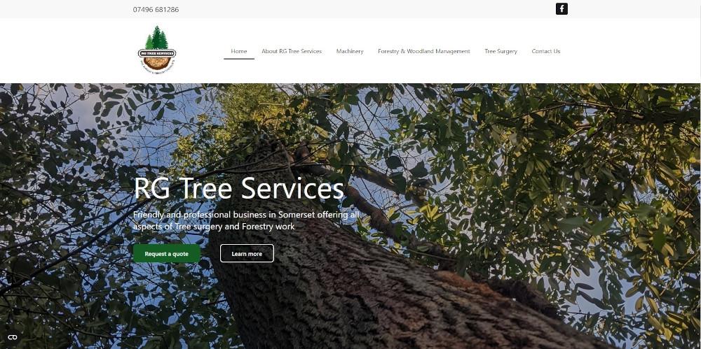
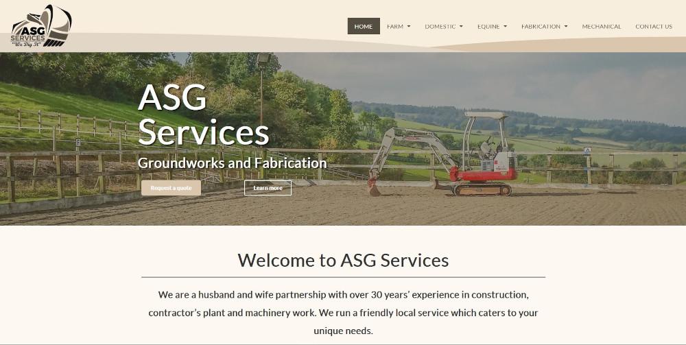
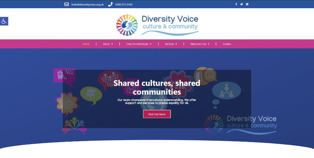
OUR PORTFOLIO


