Home / Website Design / Responsive Web Design
Responsive Web Design
Responsive Web Design (RWD) is a programming technique coded into our websites to provide the best viewing experience across many different types of display devices, including desktop monitors, smartphones, tablets and newer devices known as phablets (a cross between a smartphone and a tablet).
By incorporating correct RWD techniques a webpage will automatically adjust to display based on the resolution of the viewing device.
The following example demonstrates Responsive Web Design for the Somerset Business Awards website we developed for the Somerset Chamber of Commerce.
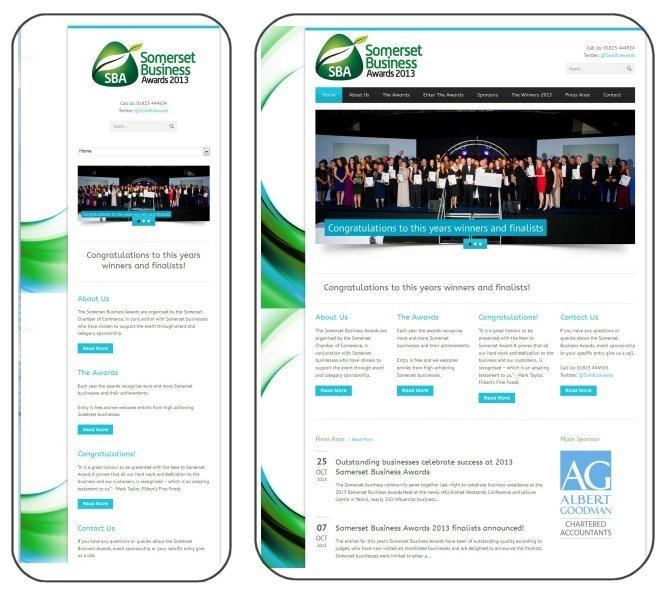
Smartphone view on the left. Desktop view on the right
The web pages were designed to display optimally on a desktop monitor 1024 px wide (or wider).
The home page contains four sections known as Information Boxes (About Us, The Awards, Congratulations, Contact Us) each approximately 220 px wide.
With whitespace (margins and padding) to the left, right and between all the sections this delivers an aesthetically pleasing page.
The text in each Information Box is easily readable on a desktop monitor typically 40cm or wider.
However, if the web page were displayed on a smartphone (say 5cm wide) the size of the text would be too small to read without resizing and panning.
To reduce the resizing and panning effort, the RWD technique displays the webpage on a smartphone with the Information Boxes vertically stacked (see left image above). It also displays the main navigation menu as a dropdown list box. Displaying it horizontally would also mean the text would also be too small to read or tap easily.
All our websites incorporate Responsive Web Design technology to ensure the best user experience for all visitors to our customer websites.
An extension of RWD technology is a smartphone-specific version of a website. This is a purpose-built subset of the full website for display only on smartphones that contains fewer (or no) images, and typically less text, to ensure a faster loading experience across slower 3G connections.
Please contact us on 01823 353760 for more information on Responsive Web Design and smartphone-specific websites.